BRANDS
  • View All
BRANDS
  • View All
BRANDS
  • View All
FIND A SHOWROOM
BUY ONLINE
INSPIRATION
Products
Brands
Where to Buy
Search
Martyn Lawrence Bullard for Corbett Lighting

A Cosmopolitan Collection, A Fantasy of Light

Beating the Winter Blues with Decor

Lighting and Decorative Tips for the Fight Against Winter

Kingston Design Showhouse

Hudson Valley Talent Comes Together to Connect

November 29, 2018
img

Kingston Design Showhouse

Hudson Valley Talent Comes Together to Connect

November 29, 2018

10 designers from 10 Hudson Valley towns doing 10 rooms/spaces. All working with/sourcing from Kingston-based makers and artisans. 

That was the idea Maryline Damour, of Damour Drake, had, and damn, was it a good one. 

But ideas don't mean anything until you bring them into the world. Damour, an entrepeneur with 20+ years' experience in business consulting, helping companies identify problems that were perplexing them and creating actionable solutions, is really good at that part. Returning to art school and studying interior design at Parsons The New School for Design a few years ago, she began a new chapter of her life as a design-build business owner and interior designer. Noticing that there was a lot of design talent throughout the Hudson Valley but that there seemed to be little connection between these individuals, Damour hatched her plan. Once she settled in the Kingston area for full-time residence four years ago, after a decade of living in both New York City and upstate, and working largely in the former, she began visiting local creative businesses, telling their owners about her idea and asking if they would be interested. They all said yes, and, to her surprise, when she followed up a year later to make good on it, they were all still 100% down. 


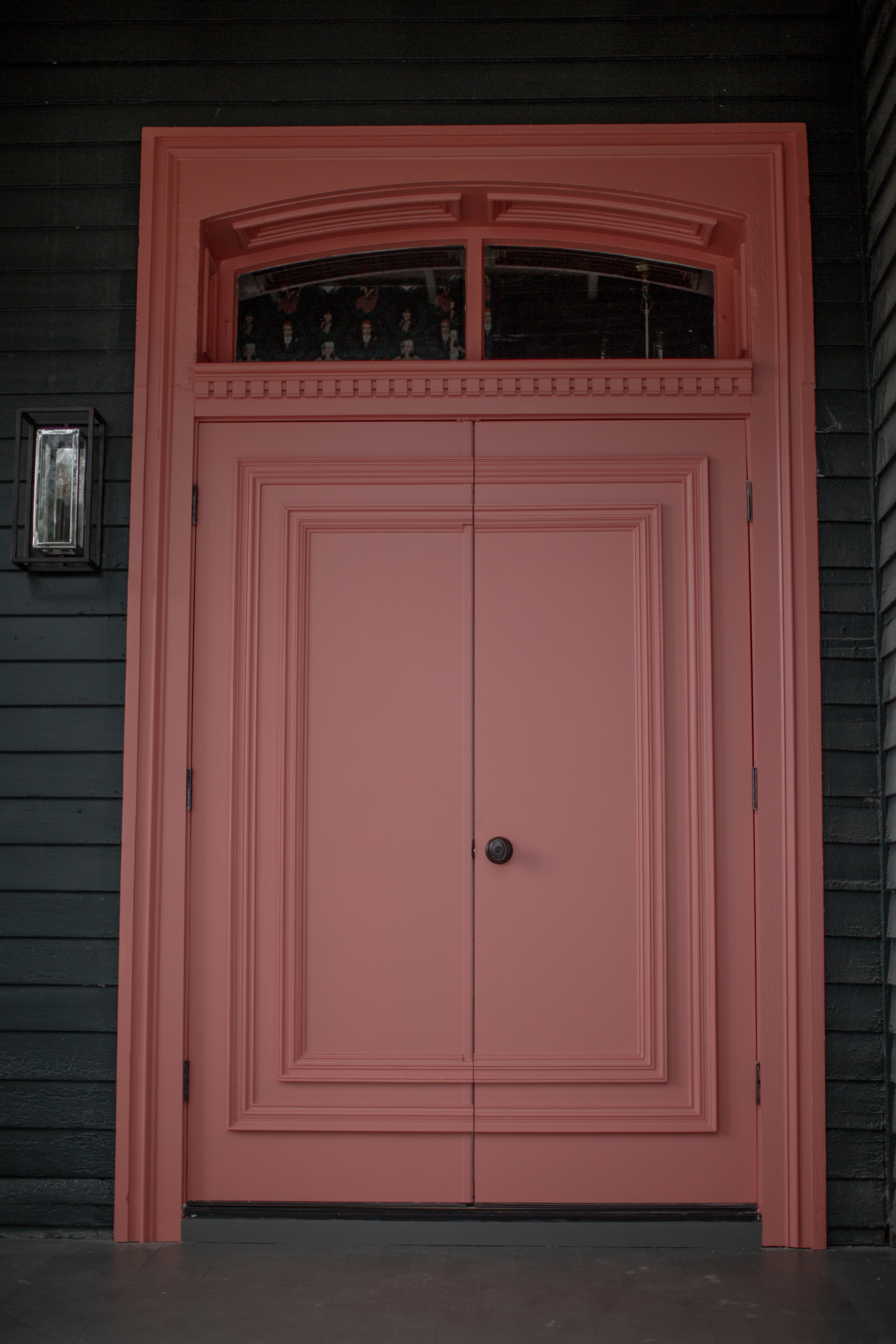
Design & Door: Maryline Damour and Mel Jones of Damour Drake 
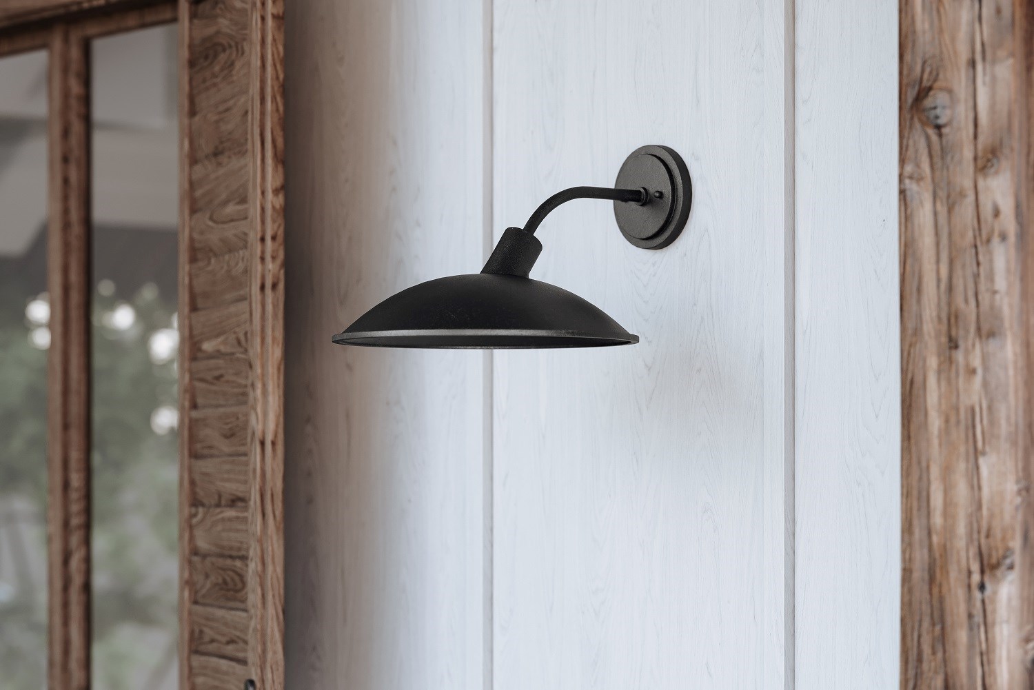
Exterior Sconce: Morgan by Troy

Desiring this project to also serve as an engine for local economic development, Damour decided early on that this showhouse would be very different from usual ones. She created the Kingston Design Connection to get local designers and artisans working together, and this space, the Kingston Design Showhouse, would be a testament to what could come out of it, and maybe even visually define the scene.

Once she had assembled a team of local designers, they got together and had a talk about what the vision was and laid down some ground rules. The Victorian structure had been split into two spaces for renting and nearly every one of its virtues had been hidden. ("It had good bones, but they were buried," she laughed in the article in Architectural Digest covering the project.) As owner of the property, restoring the space to a single residence that could support great design had been a personal mission she had invested in for quite some time.

Maryline presented an organizing design brief in addition to some questions to guide the process. "Why are we here [meaning Kingston]? What is the aesthetic? Is there one? How is the environment affecting us?"

It would have to look like a space that a creative person could live in, the sorts of people that had begun to gather in the area over the past five-ten years. Also, the area has a large mix of socioeconomic levels. Maryline wanted the house to reflect that. As opposed to the usual thing where it's as opulent and luxurious as can be and the sky's the limit, she wanted to present clever design hacks for working with a space like that one, and work a mix of high/low into the rooms, even using local box stores in conjunction with singular upscale design resources.

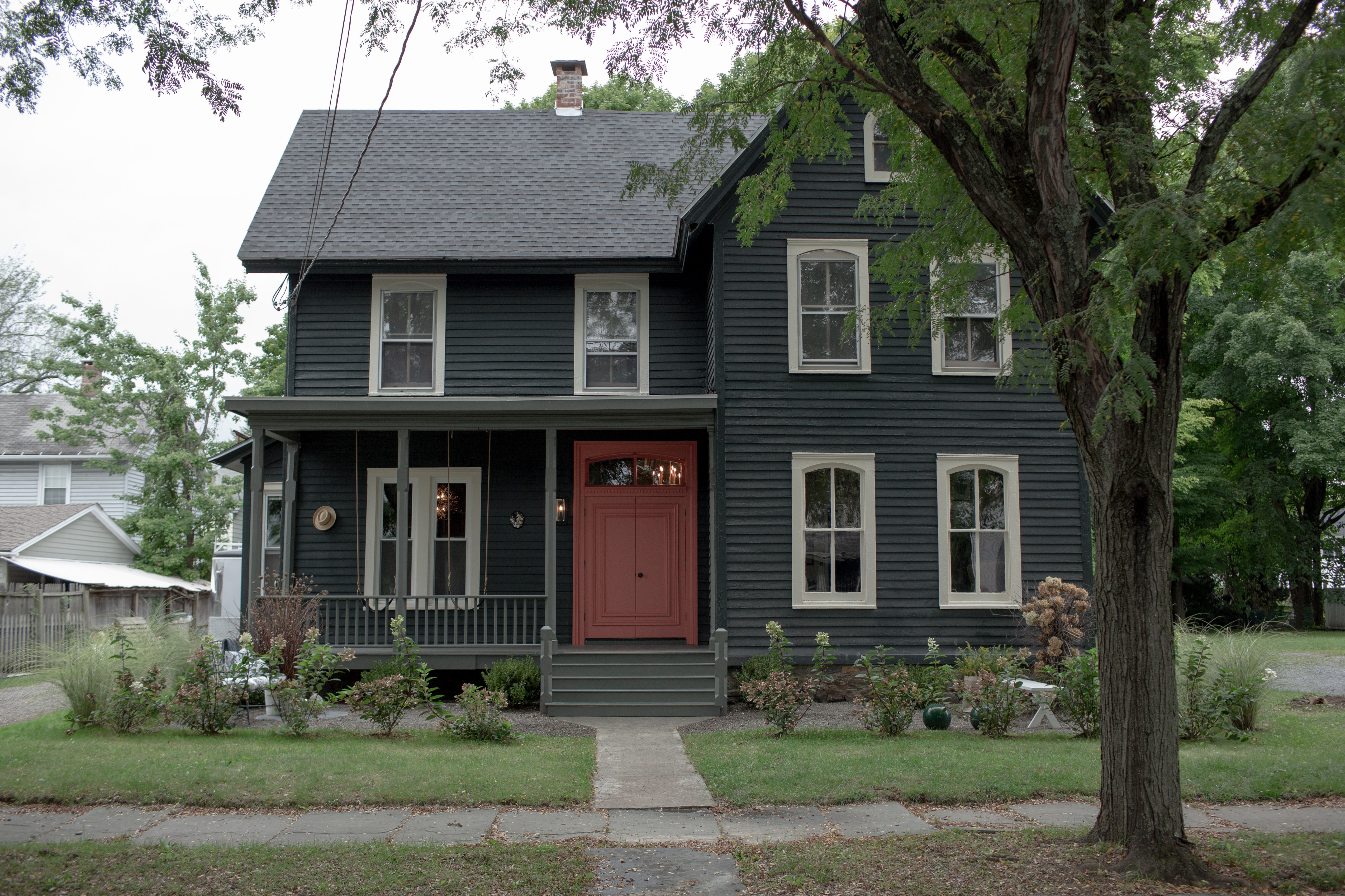
An interesting thing happened: "Interior designers wound up doing things different from their usual work." All of the designers involved took the collaboration aspect of the project to heart; they decided they wanted to work together to create a unified showhouse where the moody colors and the overall look and feel carried through from space to space. Certainly, the keynote had been struck with the decision to transform the exterior (in a way we recently discussed here) by stripping back the Victorian exterior and coating it in dark paint.


Garden: Scott Zimmer of Zimmer Gardens | Porch Design/Build: Maryline Damour and Fred Drake of Damour Drake
Swings: Jay Teske Leather Co | Sconce: Morgan by Troy Lighting | Chandelier: Abrams by HVL

With this design manifesto in place, they set about creating a unified space that, also unlike a typical showhouse, was going to flow room to room.

This created an interesting challenge. Where were they going to source that much lighting from, lighting that would both fit in with the makers vibe and complement each other toward this design unity?

Enter Hudson Valley Lighting Group, our name and location connecting in obvious ways to the showhouse's purpose.

Maryline had been aware of the HVL name, but hadn't realized the extended line of brands within the Hudson Valley Lighting Group encompassed such a vast range of fixtures. (This was a remark echoed by other designers interviewed independently).

"Once I started to see the collection and how it spoke to a range of different styles, I realized we could cover the whole project with the Hudson Valley Lighting Group. I got excited by the breadth and the variety of styles."

In addition, Maryline and the designers she worked with were struck by how our use of artisans trained in culturally-specific and demanding crafts results in pieces that have a lot of individual character. Noting fixtures like the Troy Sierra that lights the dining room, Maryline says, "It's the kind of piece of you'd think would be a one-off maker small batch. That the company can deliver the quantity it can is a plus."


This is where it starts. Troy's Morgan exterior sconce is the porchlight, a welcoming beacon. Visible through the window above the door Damour created, Hudson Valley Lighting's Abrams spills out warm light, inviting you in. To your left, beautiful swings made my local leather craftsman Jay Teske suspend from the rebuilt porch's ceiling. Isn't it easy to imagine dawdling on them, sipping homemade iced tea on a fine summer's day? Right away, it's clear: there's going to be some out-of-the-box thinking here.

Walk in and you're in the entry hall. Here, Kate Cummings of Freestyle Restyle partnered with local artist Jason O'Malley, otherwise known as Rural Modernist, to make a wallpaper specifically for the showhouse. Icons of eighties music, Deborah Harry, Siouxsie Sioux, Annie Lennox, and Morrissey adorn this incredible wallpaper, beginning a music theme that will continue throughout the space. Not only that, but the colors were carefully matched to the ones on the outside of the house and front door. Damour notes that while design-heads will appreciate the connection, it's the kind of thing that the ordinary person intuitively feels, creating that experience of cohesion and unity that's so important. For the purposes of the showhouse, it's the beginning of a journey of coordinating space to space. 

Kate Cummings kept the dark, juicy jewel tones, the women empowerment, and the rock 'n' roll vibes going in the parlor off to the right from this entryway. The result was a bewitching oasis that left many charmed. 

The flow continued into the butler's pantry and home bar by Christine Edwards of Northern Dwelling. Here, in the back of the house, things lightened up, and beautiful woodwork with a sustainable ethos by local craftsmen, such as this Hudson Stool by New York Heartwoods atop this custom floor installation by Excelsior Wood Products, were featured. 

Speaking of flow, a gorgeous bathroom remodel designed by Michael Carr awaited off of this space, with velvet curtains. As in other places in the house, low ceilings resulted in the choice of one of our many dramatic flush mounts, Sparta, to provide light and elevate the space at the same time. Superb tilework by Madison Square Design,  reclaimed countertops by Excelsior Wood Products, and fine execution by the Damour Drake team resulted in a refreshing and beautiful  These Instagram posts offer tantalizing glimpses and more information. 

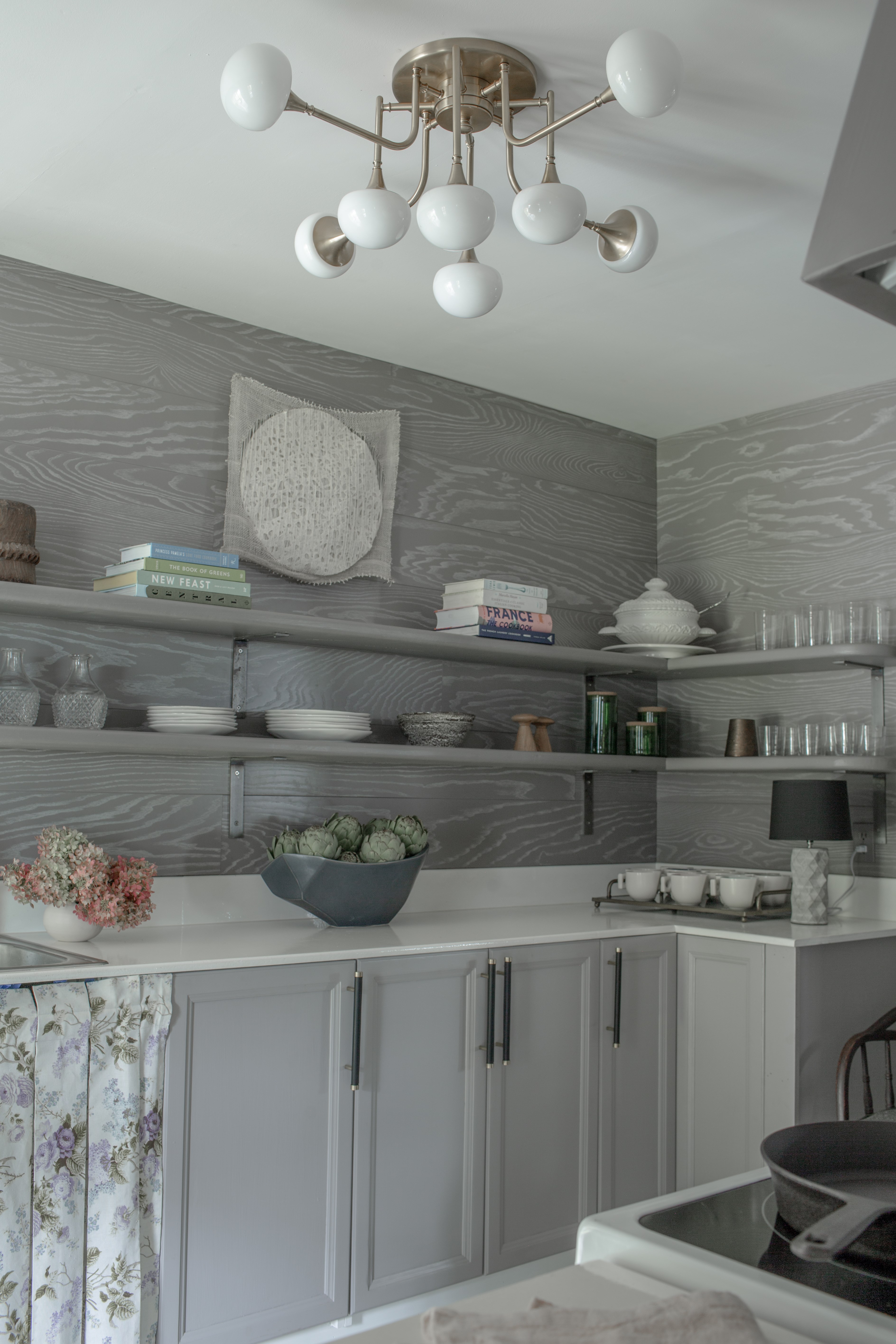
Nearby was the kitchen, which was Damour's space. Hudson Valley Lighting's Fleming semi-flush mount, custom leather cabinetry pulls by Jay Teske Leather Co, and the amazing custom shiplap walls provided the "high," while, true to her vision for the project, Maryline mixed these in with the "low" of more common elements that would be true to the area. As many homeowners would tap a nearby home improvement box store and get some basics at a corporate home goods store, Maryline mixed those in, using nice choices and local art to elevate the space. 

The walls are 100% ash. Maryline worked with a company—her only exception to the Kingston/Hudson Valley rule—that embeds any two colors you want into the wood, resulting in this beautiful grey-and-white wall.


Design: Maryline Damour of Damour Drake 
Lighting Fixture: Fleming Semi-flush Mount by HVL

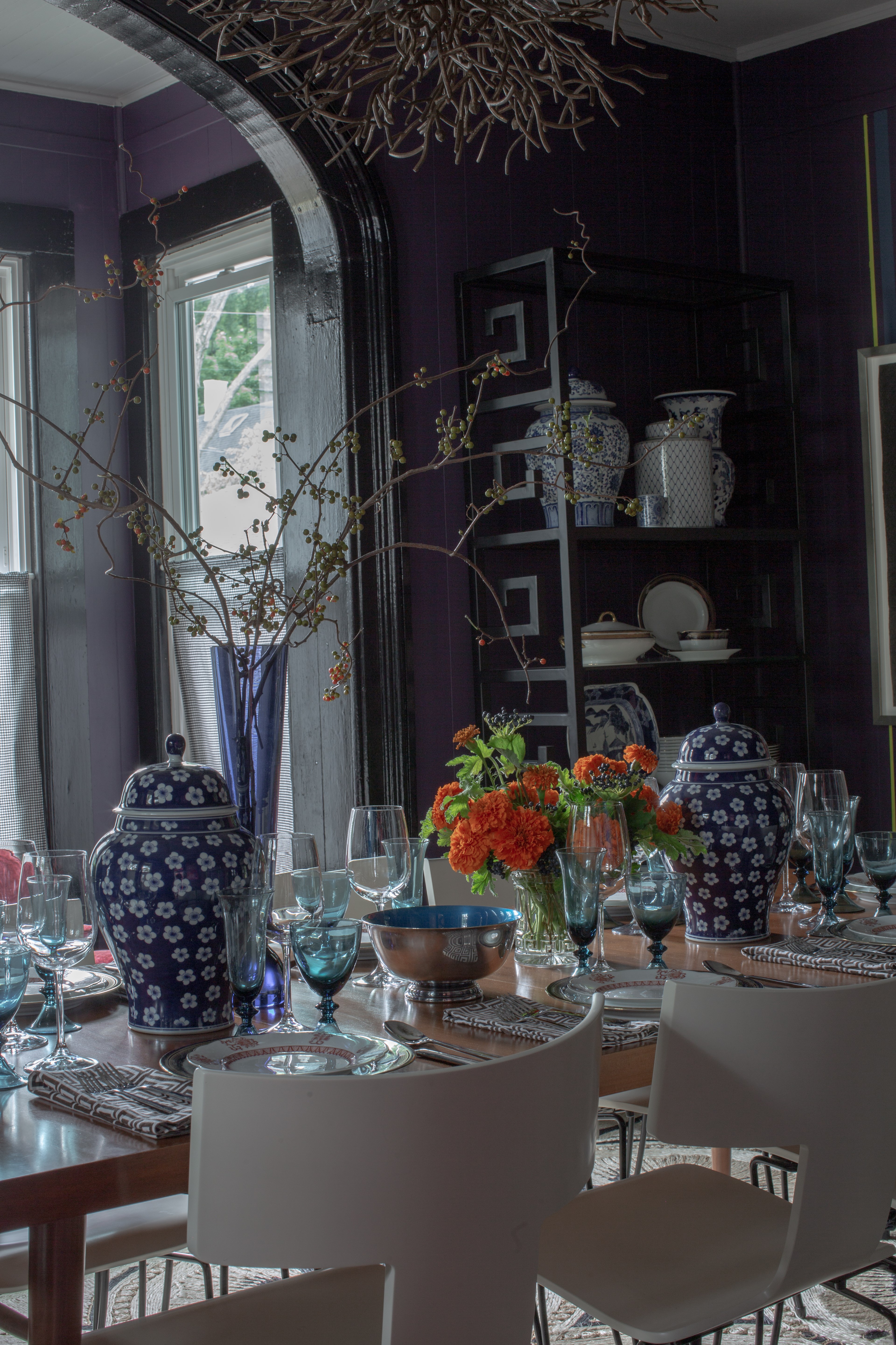
The tour finishes with two rooms. The kitchen conveniently spills into the dining room, which we touched on a couple weeks ago in our Tablesetting for Thanksgiving post. And off this room is a unique study. Depending on your stance, sightlines show a few rooms at once, fixtures from Troy, Hudson Valley Lighting, and Mitzi all working together in a unified space. 


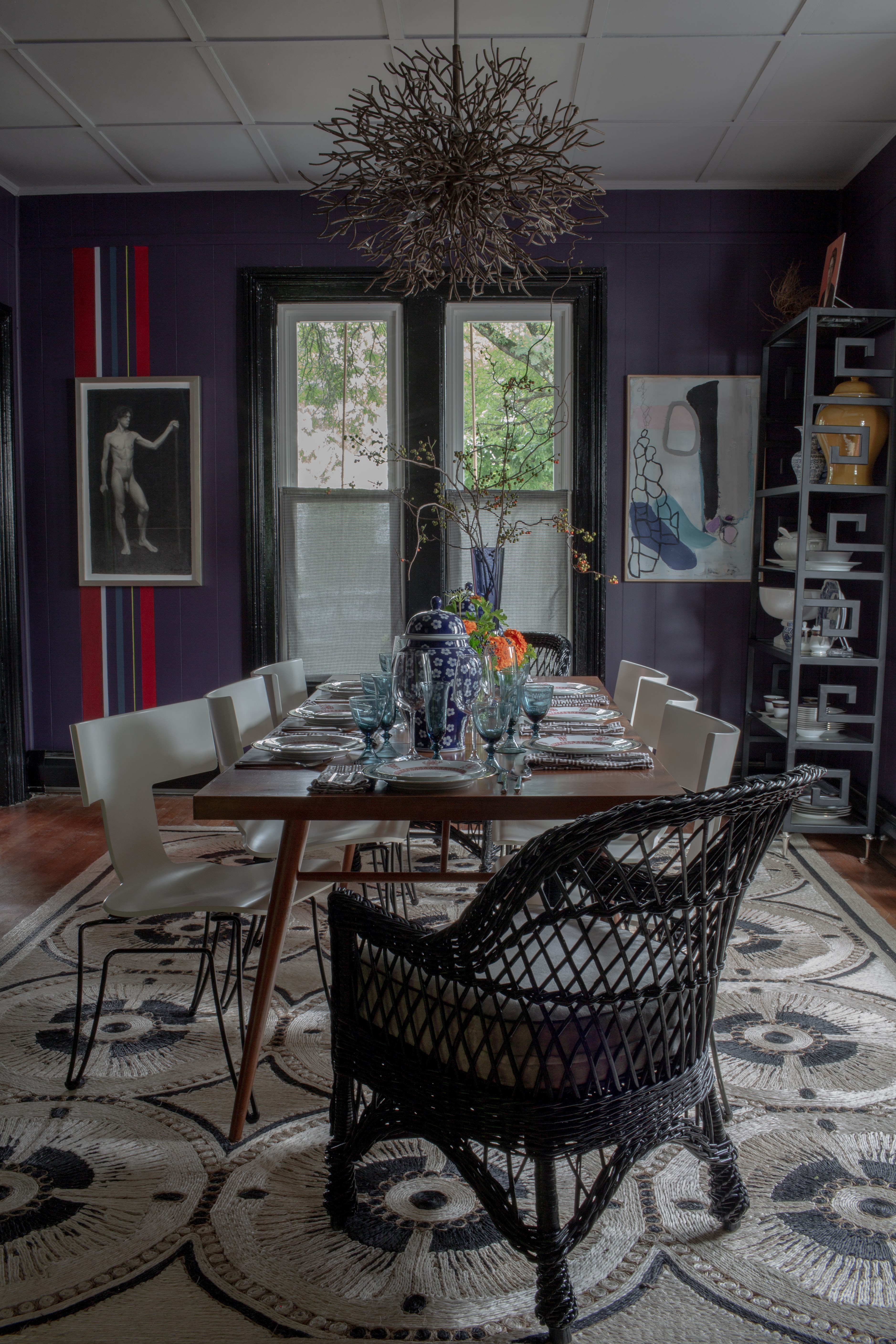
Design: FRED High Falls | Chandelier: Sierra by Troy Lighting  | Photo: Matt Petricone

Catching up with the designers of this space, Michael Van Nort and Charles Farruggio of FRED High Falls, we discussed the moody hues and interesting color striping they did on the wall. When asked about introducing color to spaces they design, they emphasized that while they have creative strategies for clients who see a need for it but aren't ready to dive in all the way, they are not here to force color on anyone. Building a relationship with their clients, establishing trust with them, and checking their egos at the doors of the domestic spheres they are about to transform: this process forms the basis of all the projects they undertake.

All of which sharply contrasts with the occasion of a showhouse.  

When it comes to a showhouse, they say, the order of the day is drama. Go to the max for something that's going to make jaws drop, that's going to look great in photos, and that's going to be entertaining. After all, people are paying money to tour the home—it should be entertaining. 

The question is never, "Is this liveable?" It's "Is this beautiful?" or "Is this dramatic?" or "Is this unique?" Discussing their selection fo the dynamic Sierra fixture by Troy Lighting for over the dining table, they reference this rubric. Several other fixtures from the Hudson Valley Lighting Group were under consideration, and as beautiful or appealing as they each were (Charles in particular was enamored of this one), branching artisan-made Sierra had that wow factor. 


Design: FRED High Falls |  Photo: Matt Petricone
Fans of asymmetry and color, they used both to stunning effect in the showhouse's dining room. If you look closely at the stripes of color on the purple walls, such as those running behind the beautiful charcoal nudes by Hudson Valley artist Laianna Ferruggia, you may notice they've been painted on the walls and do not form a symmetrical pair flanking either the doorway or the window. Michael and Charles specified different widths for each stripe as well as different colors. Taking it a step further, each stripe is a different finish, so one is matte, one is semigloss, one is satin, etc.

For the full scoop on how they took on the challenges and charms of this space for the showhouse, you can read an interview with Michael and Charles here


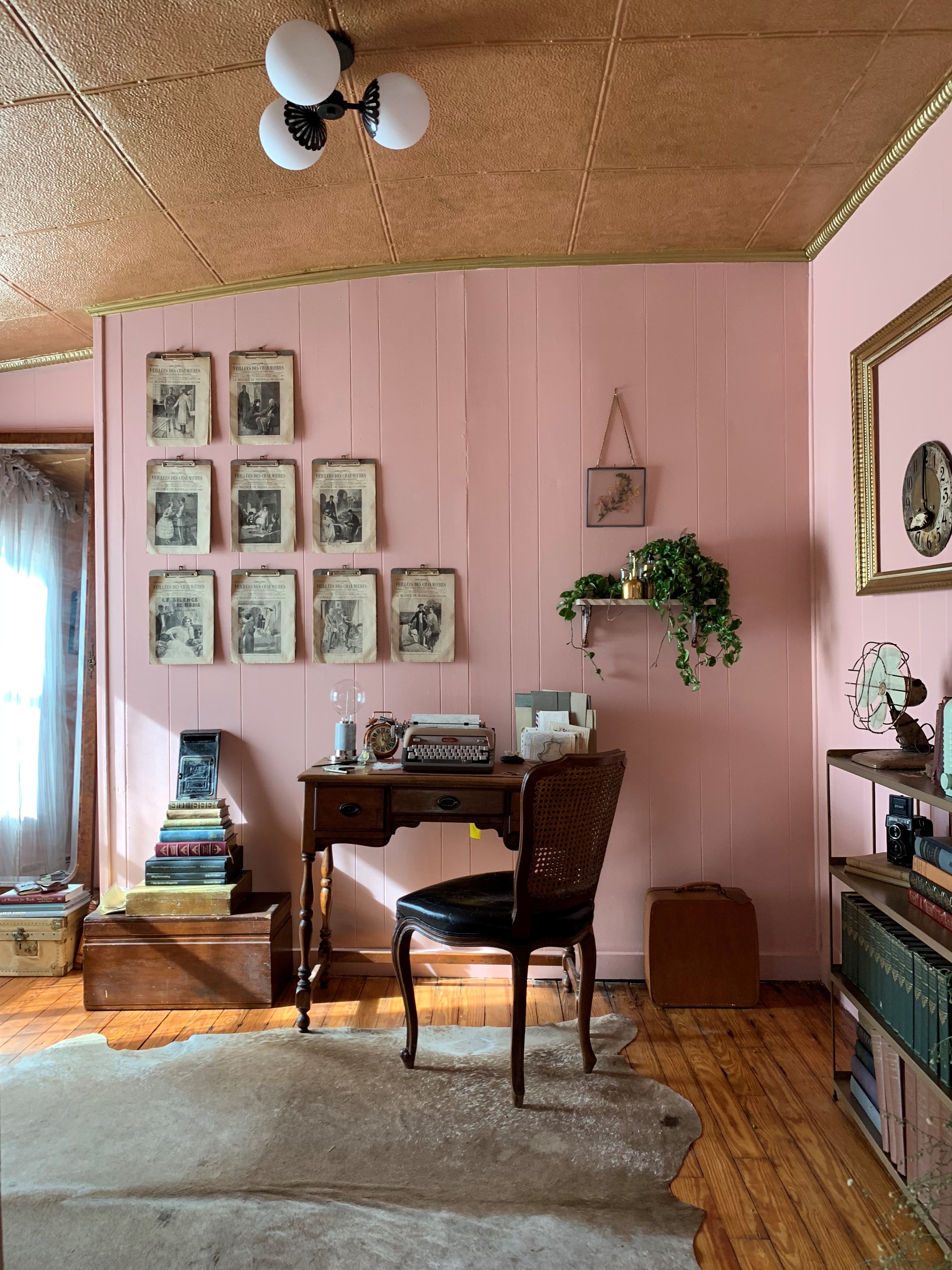
A peek into the study, designed by Margaret Verghese, from the dining room | Photo by Matt Petricone


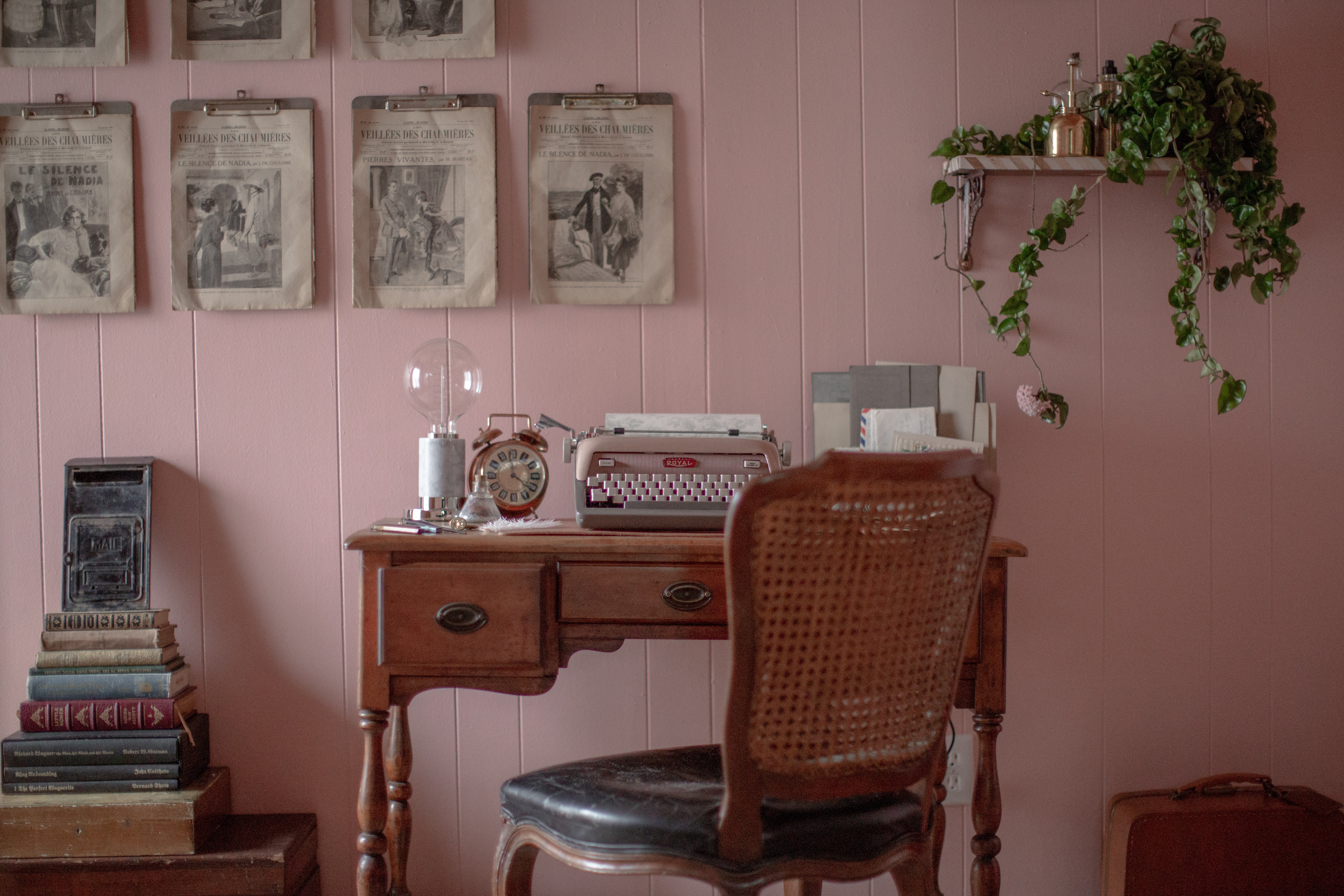
Design: Margaret Verghese, | Photo: Matt Petricone | Lamp: Asime by Mitzi

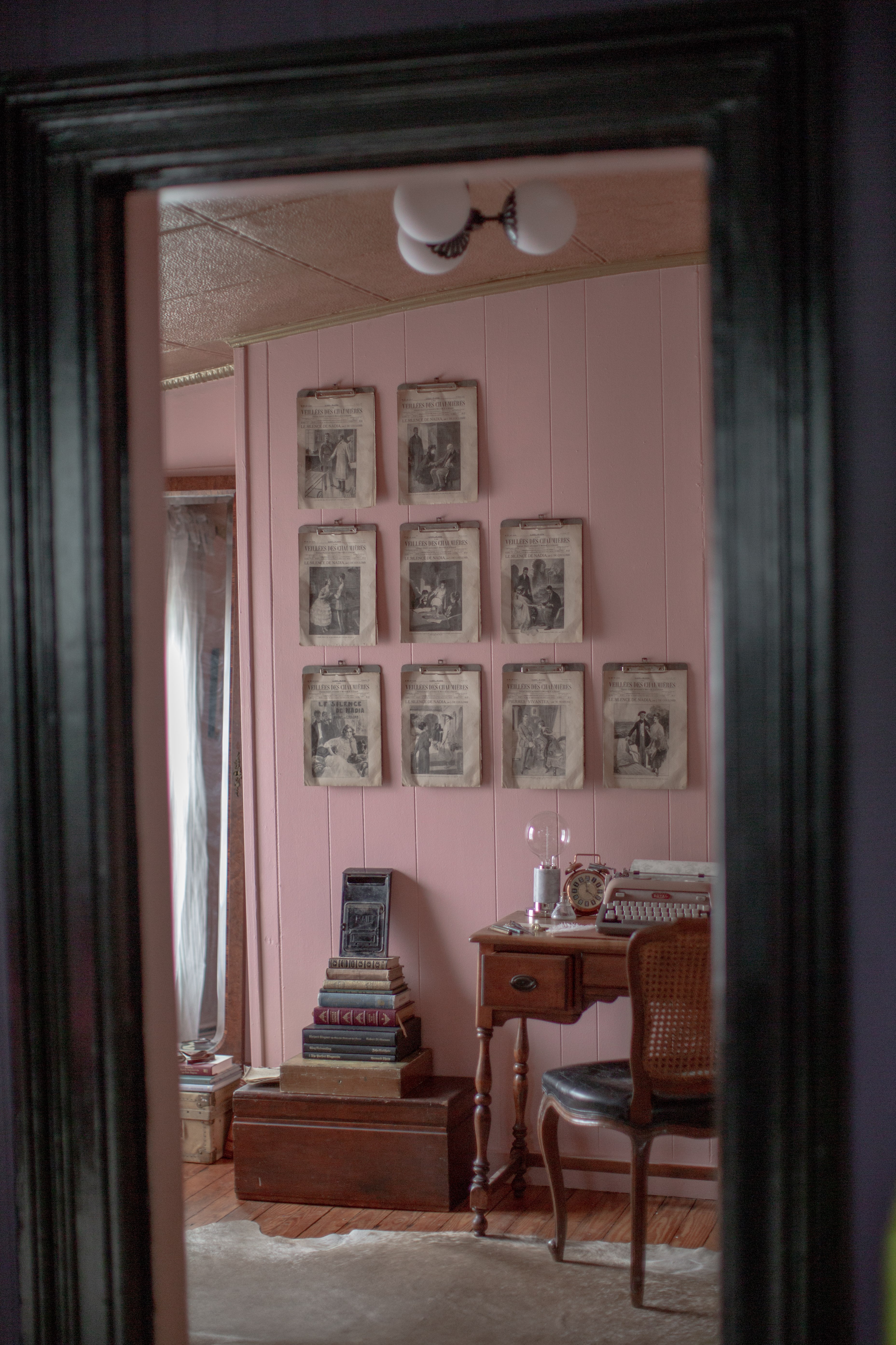
Margaret Verghese, creator of nearby vintage-paper heaven South Manor Society, a place to smell (or maybe even read) an old book and write a tactile piece of mail to send to a loved one, was invited by Maryline, who appreciated her aesthetic.

She matched her paint color to what Michael and Charles had selected for the dining room, making for a beautiful complement. An artist and photographer who is usually drawn to dark colors and spaces herself, she took inspiration from a few places, one of which is Jamie Beck's heady, sensuous AnnStreet Studio Instagram account, which celebrates maternity and femininity in an earthy, Provencal way. This inspired pink and terracotta hues.

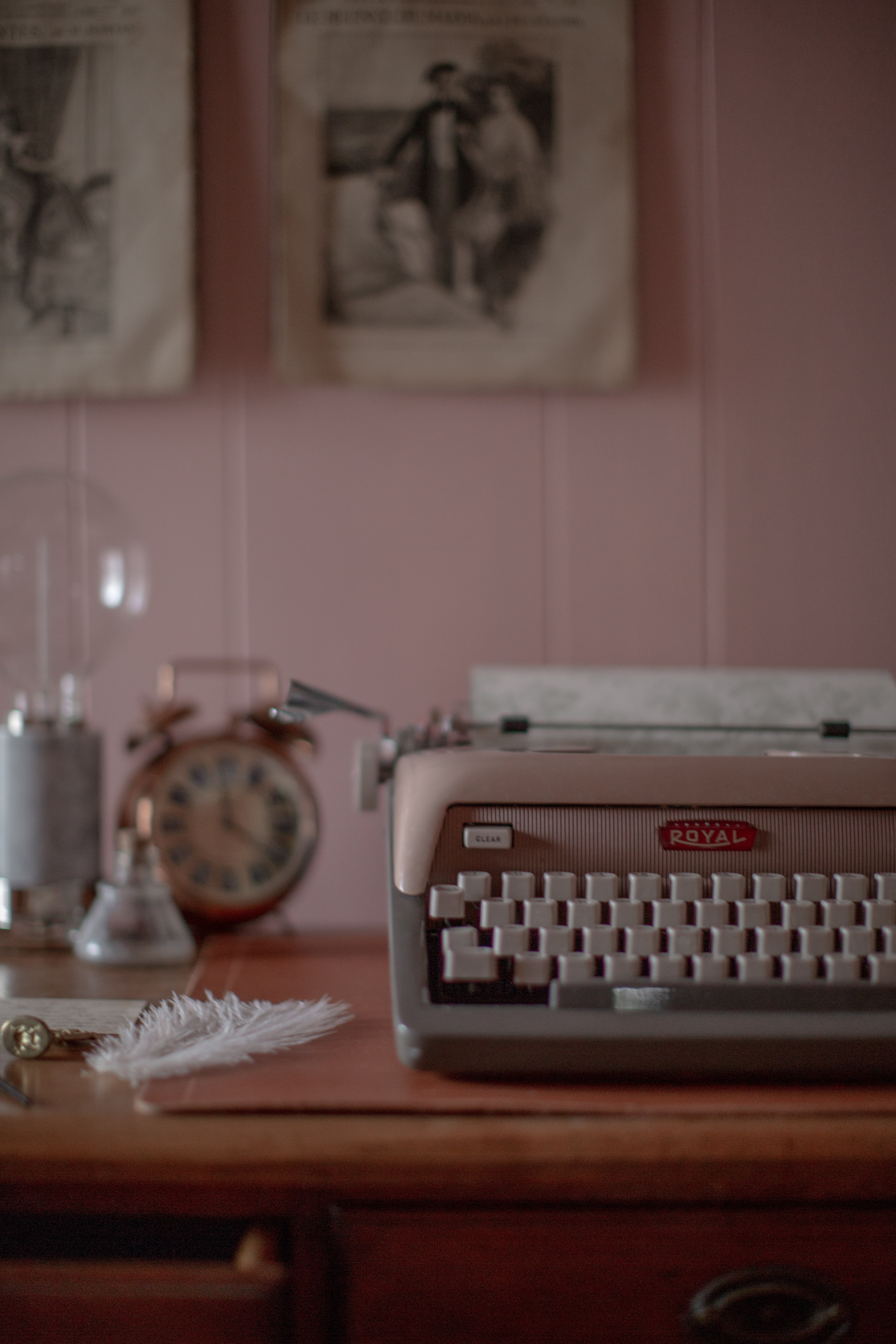
Verghese continued the themes of turn-of-the-century France and the Machine Age with an installation of a matching set of vintage industrialist French papers from the early 1900s on clipboards, which she put through a rigorous process she made up herself to give them an aged look that fit in with the room's love of the antique. Inspired ideas often take flight when two unlike things come together in the mind in a moment, and that was the case here. Margaret was intrigued by a fleeting glimpse of aged papers on clipboards along the wall in the background of a scene set in Ollivander's, from a certain movie about a boy wizard's education. This met with an appreciation for the artistic use of butterfly taxidermy in an AnnStreet Studio post, and her installation was on its way.

Asked about her selection of Mitzi fixtures, she embraced their contemporary aspects and Paige's Old Bronze finish (she's usually a brass gal, through and through) as ways to create more contrast. But while marble, such as on the desk lamp, may feel more modern, Margaret says the Edison-style exposed filament bulb of the piece, and a certain turn-of-the-century Parisian gaslamp quality to Paige's diffusers, connected these fixtures to her warmly nostalgic and French-loving vision for the space. 


Design: Margaret Verghese | Photo: Matt Petricone | Lamp: Asime by Mitzi


Photo and Design: Margaret Verghese

The Kingston Design Connection Showhouse was a wonderful idea, pulled off brilliantly. So many makers, artists, artisans, craftsmen, interior designers, landscape designers, and local businesses came together and had fun getting to know each other while making something creative happen. It did wind up reflecting a certain aesthetic developing in Hudson Valley's Kingston scene, as those who live near the area and visit it can attest. In the end, it also raised a lot of money for a good cause, the People's Place. It was our pleasure to donate to such a worthy endeavour, and rewarding to see our lights in these creative settings, complementing each other throughout the whole unified space beautifully. 

While we weren't able to cover every area of the showhouse in-depth (like the bathroom or the guest bedroom or the Morocco-inspired back porch and garden), we recommend checking out the hashtags #kingstondesignshowhouse and #kingstondesignconnection on Instagram to see more.

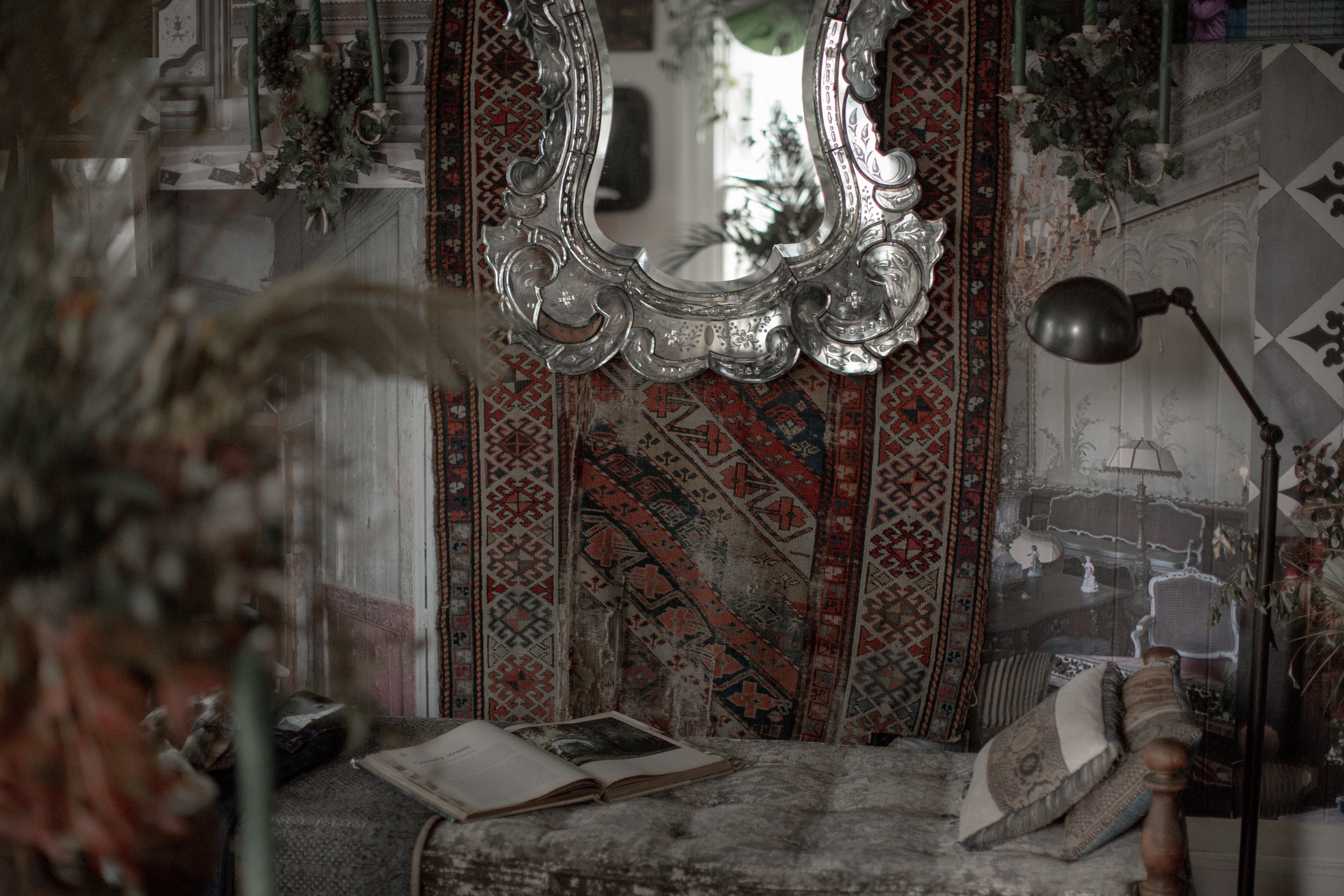
We leave you with a list of credits for the designers involved and a peek at the guest bedroom, featuring our Girard floor lamp in its opulent dreamy haze. Thanks for reading!

House exterior and porch: Maryline Damour and Fred Drake, Damour Drake

Front door: Maryline Damour and Mel Jones, Damour Drake

Entrance garden: Scott Zimmer, Zimmer Gardens

Entry Hall: Kate Cummings, Freestyle Restyle & Jason O'Malley, Rural Modernist

Parlor: Kate Cummings, Freestyle Restyle

Guest bedroom: Sean Scherer, Kabinett & Kammer

Home bar: Christina Edwards, Northern Dwelling & JT McKay, bluecashew Kitchen Homestead

Bathroom: Michael Carr, Michael Carr Design

Back porch and garden: Scott Zimmer, Zimmer Gardens & Kate Hammill, Night Space

Kitchen: Maryline Damour, Damour Drake

Dining Room: Michael Van Nort and Charles Farruggio, FRED High Falls

Study: Margaret Verghese, South Manor


All photos, unless otherwise noted: Matt Petricone


Design: Sean Scherer | Photo: Matt Petricone | Lamp: Girard by Hudson Valley Lighting